Wednesday, December 23, 2009

Xmas cards '09


Moo is a great service, I couldn't help using it for some xmas cards which will get around the world. Tried some crafty looking cards and a couple of digital ones. With an extra 3$ you can easily get some recycled paper envelopes.

Monday, November 23, 2009

Music - Illustration Friday


Pen drawing inspired by the power and radiance of orchestra ensembles

Monday, November 16, 2009

Characters

The Reverse Engineer
He is smart, expert No.1 in tearing anything into pieces.


The Chutney Maker
He is a real artist, and there is much much hard work and struggle for inspiration hidden behind a bunch of graceful jars that may entice you at the farmers' market


From a "Brief Collection of 21st Century Thriving Characters and Specialists"

Sunday, November 15, 2009

Unbalanced - Illustration Friday


Memories of chidlhood, mingling with the theme of anxiety and unbalance ... from Snow White and the Seven Dwarfs.

Tuesday, November 3, 2009

People in the Streets

One of my favourite subjects: random people, and if you look closely you'll realise that each one of them is the centre of the world!


Friday, September 4, 2009

Issue No.1 Doodle Zine


By Angela and Elena,
printed in Hamilton, NZ. It's been a lot of fun... arranging pages, spreads.. and getting everything printed, stapled and distributed! Limited edition: 60 copies, A6, covers in lemon and lavender.

Tuesday, August 4, 2009

Black paint


Public libraries are good sources if you want to use your imagination and see or read about new things. Last time I went there I got this huge hard cover book about prints and drawings: it is an old book printed some decades ago...
On the same evening I was sitting in front of the computer catching up with forgotten emails and enjoying some ice cream and then I thought I'd do something different like painting. I used the old book for some subjects since my painting style is rather "simple", still influenced by toddler and elementary school experiences :)
Used some cheap acrylic paints from Stationery Warehouse, and liked the results. Look forward to trying the colour ones and possibly larger size of paper.

Tuesday, July 28, 2009

Freedom Hour Illustration


It's been one of those cold days where you want to be inside in a warm and toasty room, but for some reason you have to go to work and maybe wait half an hour for a good old bus to come and pick you up. Though I haven't had much time lately for illustrations, I thought I'd post something I did recently thinking about one of my favourite songs (by Italian songwriter De Andre'). The title is Nella mia Ora di Liberta, which could be translated "In my freedom hour" and explores the theme of equality in such environments as prisons (society), and yet the chance for the individual to be different from his jail wardens and the possibility of camaraderie between prisoners (or workers).

Tuesday, July 14, 2009

Hollow? .....Illustration Friday

Last Saturday I was meant to do something I have been procrastinating for about a month: starting to write an essay for the end of the contemporary theory course, but the sketchbook tempted me with the possibility to tweak a meaningless sketch of bendy trees I made recently...
I was having breakfast and multi-tasking in front of the computer, when I thought: ok, I'll add a cavity to one of the trees and that will do for something hollow . Then I added more and more details, and finished just a few seconds before coming across the Flight of the Bumblebee, which would make a good soundtrack for the topic.


Actually, Danny Elfman's Beetlejuice theme could be another good soundtrack for this!

Monday, July 6, 2009

The Tree Man


The Tree Man is an amazing artwork and concept by Netherlandish master Hieronymus Bosch.
I got this giant book of prints and drawings from the Hamilton Library (yes, the same library where 2 gangs started a fight last week and at the end 4 were arrested), and I couldn't help trying to copy the Tree Man and a couple of other drawings and paintings.
The version I chose is pen and bistre, later adapted by Bosch into the right panel of his Garden of Earthly Delights.

Wednesday, July 1, 2009

Henry


I got some nice vintage textures today from deviantart and thought I'd reuse some of my old drawings to experiment a bit. This one is Henry VIII, copied from some book of prints: it looks like he might have enjoyed this rich setting and the darkness of the environment...

Phone Conversation No. 1


I was on the phone with some folks from Italy the other day, and when I say phone I mean I was skype. I'm not saying that I didn't like being on the phone, actually I quite enjoyed the conversation with my family and friends, but for some reason I always had a need to draw, and draw a lot, during each conversation which is at least 2 minutes long.
So I thought, why not use this for some experiment with textures?

Monday, June 29, 2009

Illustration Friday - Worn


Worn... this is something like a worn bird, whose wings are too old and wound, and whose body is too tired to fly.. the world is only a memory behind

Thesauruses

"What does a Thesaurus look like?" Idea from my friend Angela, during a casual conversation in front of some tea and feijoa juice. Possible development into a collection of figures.
Check out Angela's entry!

Sunday, June 21, 2009

Down the Staircase


Just thought I'd post another illustration I made for my last assignment in Narrative Illustration.
Creating the setting and making up some characters was a lot of fun... and when it came to the cat, I thought I'd make it look like a special puppy-kitty. The staircase itself is meant to be a bit creepy and threatening, so that you feel some empathy toward that skinny kid.

Another life coach


Second version of the caricature for a life coach.
It's a fun project and I'll get to do more in the next weeks.

Saturday, June 20, 2009


I haven't seen many caricatures of life coaches on the internet.... This is what I've come up with.
The risk of doing a caricature is that the person who is portrayed might not be as open-minded and ironic as you are :-P and some symbols might not be so easy to decipher
The child on top of the bar represents "life" (life coaching..), but it might be something that nobody understands except me... For this reason I just edited the whole thing and made a new caricature, using pen and ink (for nice comic style effects) and replacing the child with a teenager (because this life coach is a spiritual teacher for teenagers).
Will post soon :)

FIsh and Chips illustration


Pen and ink, digital colouring

Wednesday, June 17, 2009

Portrait of a chav


One of a series of illustrations I made for my part-time course in Narrative Illustration. Chavs are amazing creatures who grow in Great Britain, definition on the Urban Dictionary to check out

Tuesday, June 16, 2009

My Big business card works!

When asked for my business card today, I didn't have one. Instead, I took out of my folder an A3 pamphlet, with portfolio and resume alltogether in one.


Ok, I have to admit: it's not my original idea, but something I came across on Jacob Share's website http://jobmob.co.il/
and decided to adopt for my interviews. The result? Your employer can't help staring at such a big and colourful super brochure, and won't let you take it away from his/her hands!

Monday, June 15, 2009

Saturday, June 13, 2009

Latest poster designs

The Marketing Obsession


The Manhattan Film Festival

Bumble bee


Here is the bee I used on my website for the contact me section. Unfortunately the website is offline, due to problems with the hosting. But there is always a silver lining...I can concentrate on blogging! :)

I am an illustrator, which in the art world, is very much equivalent to


I thught I'd make a nice banner for this forum, so I've been playing around with Illustrator and some nice fonts... to give it a grunge style, with a touch of old-style with pen doodles acually made with vectors.

The idea comes from the issue that illustrators sometimes don't have a clear position in the job market, or in the art world, or in the world in general: sometimes people don't even know what they do, others just place illustrators somewhere along the range which goes from graphic designers to fine artists.
One of the best things I found about this whole issue is a self-explanatory illustration by Brad Holland:


O


One of the most hilarious definitions: "I am an illustrator, which in the art world, is very much equivalent to whore”, by Molly Crabapple
She does crazy victorian-style illustrations and here is a video where she talks a bit about herself: http://vodpod.com/watch/1086656-i-am-an-illustrator-which-in-the-art-world-is-very-much-

Function, Flow and Glow

This is a recent illustration I made while listening to an audiobook by David Deida, an american researcher and spiritual teacher: he talks about the possible positive outcomes of therapy, yoga and spiritual practice. For more information, check out his website http://www.deida.info/


My pencil drawing follows the flow and content of the speech and represents the way therapy can lead from dysfunction to function: squares and fragments of shapes. If you take a step further, Yoga allows the achievement of flow: spirals, round and soft shapes. Spiritual practice eventually leads to glow: powerful rays and

Friday, June 12, 2009

Capturing the essence of a fairytale tree


A few days ago I went for a walk with one of my flatmates to buy some groceries. We were sharing ideas and I was surprised by the sight of the autumn trees: they looked like people, desperately using their trunks to express their longing for something.
Beautiful powerful, skinny or robust branches.

I made this illustration a couple of months ago for a project called The Juniper Tree: it's a fairytale by the Brothers Grimm, rather spooky. Check out the Gutenberg Project free files at http://www.gutenberg.org/etext/2591
This is a detail of the illustration: I used pen, and a combination of digital or ink colouring. What I tried to express is the intense presence of the juniper tree: it almost becomes more human than the little speechless and powerless man besides.
As Mervin Peake says in his writings, "Don't be afraid to express what you see, the impression you had when you were inspired": the viewer probably doesn't want to see something realistic otherwise he'd be happier with a real tree in front of him. Illustrations can do something magic, like words can do in a fairytale.

bomb at the masquerade ball

Some strong just strike our imagination for their creativity and inspired content. In the music industries and among emerging bands there is demand for cd covers and event poster design and so on... I never considered doing illustrations for an entire album and each song, before listening to the album of an Italian songwriter called Fabrizio De Andre'.

The lyrics is about a mysterious character who is unable to put up with the mediocrity and hypocrisy of society. Ironic lines follow one another offering the most original paradoxes ever: christian holy figures tired of their wretchedness and tempted by the possibility of a Nobel Prize; a tough competition between the Statue of liberty and a mythical Statue of Pity...

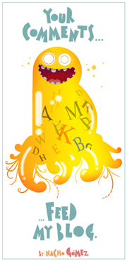
By the end of this queer and cryptic song, the guy has dropped a bomb at the masquerade ball. I made this illustration without preliminary sketches, thus the naive touch and some random imperfections. I used a superfine black pen on A4 paper, while listening to the song for about four (maybe more?) times in a row with my ipod shuffle.